5 min read
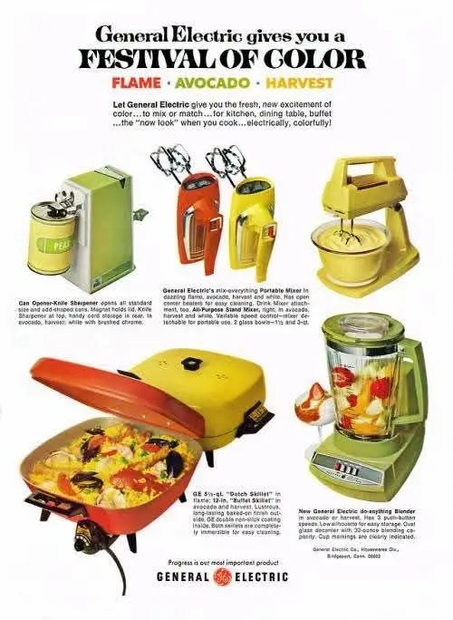
Avocado green, harvest yellow, and fiery orange-red. In this 1969 General Electric advertisement, consumers were not simply choosing between mixers, blenders, skillets, and can openers. They were choosing appliances designed to become part of the kitchen’s color scheme. GE called the campaign: “Festival of Color.” It captures a moment when small electrical appliances were becoming not only useful machines, but visible elements of interior design.
Article Content
A “Festival of Color”
The advertisement presents three named colors:
FLAME • AVOCADO • HARVEST
Across the page, General Electric displays a can opener and knife sharpener, portable mixers, a stand mixer, electric skillets, and a blender in striking coordinated colors.
A historical advertising archive identifies this particular General Electric “Festival of Color” advertisement as dating from 1969.
Why Did Appliance Color Matter?
By the late 1960s, American kitchen design was moving beyond the predominantly white, metallic, and pastel look associated with earlier decades.
Warmer colors—including avocado green and harvest gold—became increasingly prominent.
The Smithsonian National Museum of American History preserves an avocado-green electric can opener dating from around 1970 and specifically notes that its green housing reflected a popular color scheme for kitchen appliances at the time.
Design histories also document the late-1960s movement toward warmer appliance colors such as avocado and harvest gold.
Color was becoming part of the purchasing decision.
This Was an Actual GE Campaign
A trade publication from April 1969 reported that General Electric’s spring housewares advertising would place a major emphasis on color through a campaign called “Festival of Color.”
The campaign included four-color magazine advertising and color television commercials.
Color was therefore not merely a feature of the products.
It was the central advertising idea.
Appliances Became Décor
Small appliances often remained visible on kitchen counters.
That created a new opportunity.
A blender or mixer could be sold not simply because it worked well, but because it complemented the surrounding kitchen.
The advertisement even encouraged consumers to mix or match colors.
In other words, the appliance was beginning to behave almost like a decorative accessory.
Avocado and Harvest
Avocado Green became one of the most recognizable appliance colors of the late 1960s and 1970s. The Smithsonian’s circa-1970 avocado appliance offers material evidence of how widespread the color scheme had become.
Harvest Gold similarly became associated with kitchens of the period. Design sources document Golden Harvest kitchen appliances in advertising from 1969, showing that the trend extended beyond General Electric.
What Does the Advertisement Preserve Today?
The appliances themselves may look simple compared with modern kitchen technology.
But the advertisement preserves an important shift in consumer design.
People were no longer being asked only:
“What does this appliance do?”
They were increasingly encouraged to ask:
“What does it look like?”
“What color should I choose?”
“Does it coordinate with my kitchen?”
We still make similar choices today when buying coffee machines, mixers, kettles, phones, and computers.
The colors change.
The relationship between function, design, and personal identity remains.
“Once the appliance was given a deliberate color, it was no longer simply a tool in the kitchen—it became part of the image the home was designed to present.”
Memories of Days Gone By ᥫ᭡
Rana Elgogary
Expert Tip
«When you see a vintage appliance in a color that seems unusual today, don’t ask only: “Why did they choose that color?” Also ask: “What did people of that period want a modern home to look like?” Color can tell us more than what was fashionable. It can reveal an era’s idea of modern living itself. Memories of Days Gone By ᥫ᭡ Rana Elgogary»
Conclusion
This advertisement documents General Electric’s 1969 “Festival of Color” campaign, which promoted small appliances in the coordinated colors Flame, Avocado, and Harvest. A contemporary 1969 trade publication confirms that GE used the campaign across magazine and color-television advertising. The advertisement also reflects a broader late-1960s design shift in which colors such as Avocado Green and Harvest Gold became prominent across kitchen appliances and interiors, making appliance color part of the consumer’s design decision as well as its practical function.