5 min read
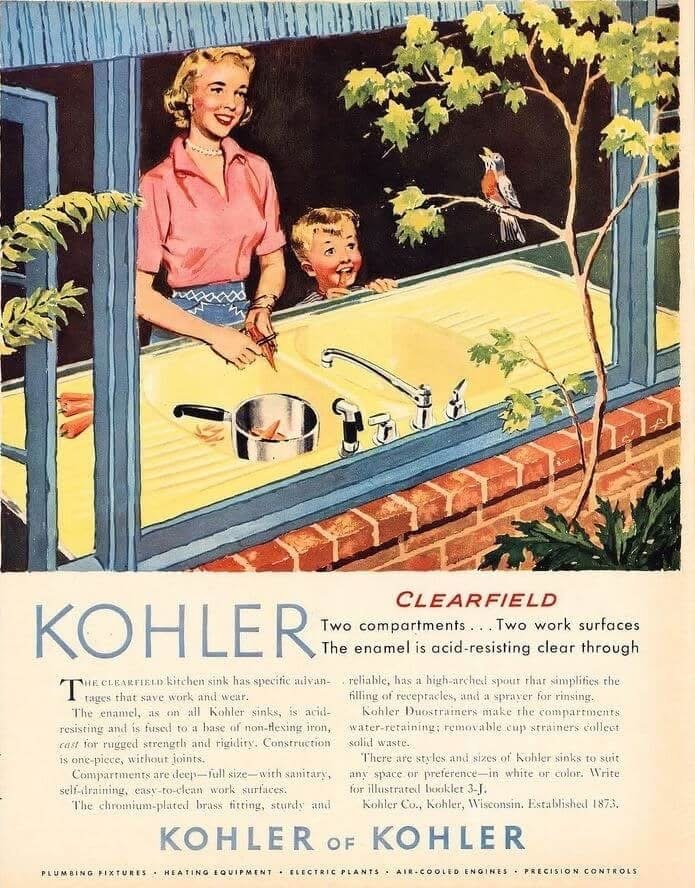
Two separate basins, two work surfaces, a high-arched faucet, a sprayer, and generous space for everyday kitchen tasks. This is how Kohler presented its Clearfield sink in the mid-1950s: not simply as plumbing, but as a kitchen work center intended to make everyday tasks more organized and convenient. The advertisement also reveals something broader about its era—how the idea of the “modern kitchen” was closely tied to women’s domestic work.
Article Content
A Sink Designed as a Work Center
The advertisement introduces the Clearfield with a simple promise:
“Two compartments… Two work surfaces.”
The point was functional.
Separate basins could support different washing and rinsing tasks, while the integrated side surfaces provided space around the sink for everyday preparation and cleanup.
Period Kohler advertising similarly described the Clearfield in terms of deep basins and integral drainboard work areas.
The sink was therefore being presented as more than a place for running water.
It was becoming a work center.
Fewer Steps Around the Kitchen
The faucet, sprayer, strainers, basins, and work surfaces were all positioned around the same area.
The design message was straightforward:
bring useful functions together and reduce unnecessary movement.
That principle remains familiar in contemporary kitchen planning.
We still think about where food will be prepared, where dishes will dry, how easily large cookware can be washed, and whether a sink can support more than one task.
Enamel Was Part of the Selling Story
The advertisement describes the enamel as acid-resistant, while other Kohler trade advertising from the period emphasized cleanability, resistance to spotting, and rigid cast-iron construction.
These statements should be understood as period product claims, rather than independent modern testing.
Historically, however, they reveal exactly what the company believed consumers valued:
durability, cleanliness, and an attractive finish.
Color Was Modern Too
Kohler’s own history notes that in 1927 the company began offering coordinated colors across cast-iron enamel and vitreous-china fixtures.
By the 1950s, color had become part of the idea that kitchens and bathrooms could be designed visually—not simply equipped functionally.
The modern home was expected to work well and look intentional.
A Longer History Behind the Sink
Kohler was founded in 1873.
In 1883, John Michael Kohler coated a cast-iron trough with enamel and marketed it for use as a bathtub, helping launch the company’s plumbing business.
By the time the Clearfield appeared in 1956 advertising, enameled cast iron had already been part of Kohler’s history for decades.
Who Was the Advertisement Speaking To?
The woman occupies the central domestic role in the illustration, with a child beside her.
Period Kohler trade advertising similarly described kitchen sinks in relation to the “housewife” and even used language presenting features as appealing to wives.
That wording reflects a common advertising assumption of the period:
the modern kitchen was supposed to make women’s domestic work easier.
Technology was being used to reduce effort, while the underlying assumption about who performed the work remained largely unchanged.
The Advertisement Sells a Lifestyle Too
The sink is surrounded by a pleasant domestic scene:
a smiling woman, a child, a bird, a tree, and an open view outdoors.
This is not accidental.
The product is being associated with a larger image of domestic life:
organized, modern, pleasant, and calm.
The advertisement therefore sells both a sink and an imagined household experience.
From 1956 to Today’s Workstation Sinks
Modern kitchens still use many of the same functional ideas.
Kohler’s current kitchen-sink range includes double-bowl designs and workstation sinks equipped with accessories such as cutting boards and racks.
The materials and styling have changed, but the underlying concept remains recognizable:
A kitchen sink can be more than a basin—it can organize the work that happens around it.
“Vintage advertisements preserve more than the appearance of old kitchens. They also preserve the way each generation tried to make everyday work easier and more organized.”
Memories of Days Gone By ᥫ᭡
Rana Elgogary
Expert Tip
«When looking at a vintage kitchen advertisement, don’t study only the appliance or fixture itself. Ask: “What everyday problem was this design trying to solve?” Was it reducing movement? Combining several functions? Making cleaning easier? Saving workspace? Sometimes an old household design tells us more about how people lived and worked in its era than its appearance alone. Memories of Days Gone By ᥫ᭡ Rana Elgogary»
Conclusion
Kohler’s archives identify the Clearfield among the company’s 1956 advertisements. Its design emphasized two compartments, two work surfaces, and features intended to organize washing, rinsing, and other kitchen tasks. The advertisement shows how a sink’s function, design, and color became part of the mid-century idea of the “modern kitchen,” while its language also reflects the period’s assumption that domestic kitchen work was primarily women’s responsibility.